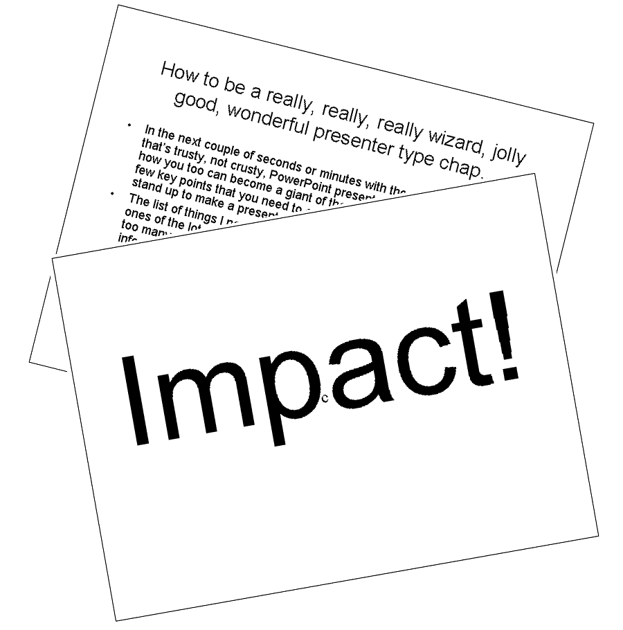
OK, without spending too much time playing bad slide, good slide with you, here are the three things people get wrong most often when creating PowerPoint presentations.
Too much information on each slide
But what's so wrong about that? 
Inevitably, the more text you put on a slide, the smaller the size of the text. Even in a small presentation venue some members of your audience may not be able to read your slides – they may have forgotten their glasses, be sitting too far away from the screen or they may not even realise they need corrected eyesight.
Less and therefore larger text has far more impact and is so much easier to read.
And what does your audience do as soon as you show them a slide? Every one of them will read the whole slide. The more text on your slide the longer they take to read it and the more time you have to waste waiting for them to finish. There is absolutely no point in talking to them until they have finished reading because their attention is on the slide and not on you! And surely it's pointless telling them what they've just read...
To avoid these problems, don't write down everything you are going to say. This has two advantages. Firstly, you naturally have less to include on each slide. The second and more important advantage is that you can adjust the content of your presentation to suit the audience as you go.
Too much variation in colours and fonts
If the main point on your first slide is in red, on the second it's in blue and on the third it's in green, by the fourth slide your audience will be taking bets with each other about the colour you are going to use next – and that means they are not paying attention to you and the important point you are trying to make.
Anyone who drives knows what is happening when a large red vehicle with blue flashing lights appears in their rear view mirror even if they cannot read the word FIRE written on the front. Sport is consistently located at the back of newspapers to make it easy to find. A handle on a swing door means PULL while a metal plate means PUSH.
None of these and many other examples are accidental. They are all designed to make it easier to communicate important (or not so important) information quickly and easily.
Consistency improves the communication between you and your audience. As long as the style, layout and colour scheme of your slides is consistent, after the first few slides you show your audience will have learnt the colour, textual and visual clues that you are using.
Too much distraction
Many presentation courses will suggest that you make your presentation graphics 'interesting', explaining that lots of movement makes the slides less boring. Video clips, strange cartoon creatures running around and animated, looping and spinning text are all recommended.

 All these techniques do is to cause distraction. Your audience have come to see you, not your PowerPoint presentation.
The fact that a PowerPoint presentation can be distracting comes as a great relief to many presenters as many people would prefer to hide in a corner and let the audience watch their slides rather than have any attention focussed on them.
But never forget, however bad you think you are as a presenter, you are what is interesting. You are the person your audience want to see and hear. They came to listen to you, not to marvel at how good you are at making PowerPoint jump through hoops...